Claude Can Now Build Charts and Diagrams in Conversation
Anthropic ships inline visualizations for Claude — interactive charts, diagrams, and visual explanations rendered directly in chat using HTML and SVG. Available to all users, including free tier.
Three days after OpenAI added interactive visuals to ChatGPT, Anthropic shipped the same capability for Claude. The timing isn't subtle. But the implementation is different enough to be worth a close look.
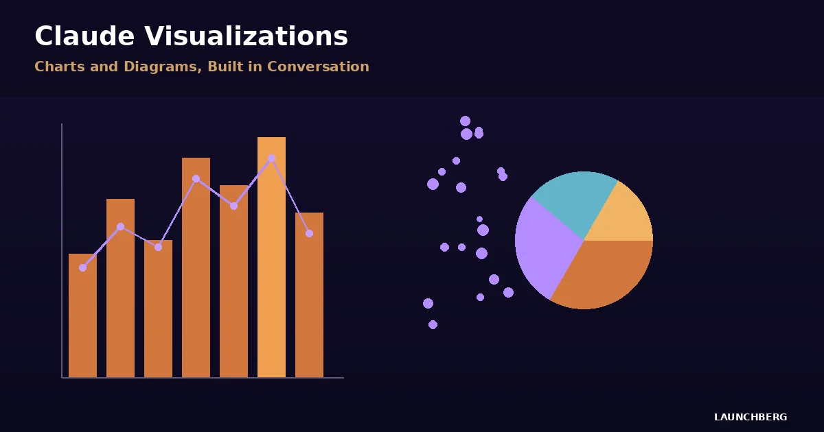
Claude can now generate charts, diagrams, and interactive visualizations directly inline in conversations. Not in a side panel. Not as a downloadable file. The visuals appear as part of Claude's response, built with HTML and SVG, and they support hover and click interactions. Ask Claude to explain compound interest, and you get a chart with sliders you can actually drag. Ask about the periodic table, and you get a clickable table where tapping an element shows its properties.
How It Differs From Artifacts
Claude already had artifacts — standalone code snippets, documents, and applications that appear in a side panel. The new inline visualizations serve a different purpose. Artifacts are persistent, shareable, and meant for finished work. Inline visuals are ephemeral — they exist to aid understanding in the moment, then evolve or disappear as the conversation moves forward.
Think of it this way: if you ask Claude to build you a dashboard, that's an artifact. If you ask Claude to explain why your revenue dropped in Q3, the chart it draws inline is a visualization. One is a deliverable. The other is a thinking tool.
The range of supported formats is broad. Bar charts, line graphs, pie charts, scatter plots, flowcharts, org charts, timelines, roadmaps, concept maps, customer journey diagrams, step-by-step visual guides. Claude generates them on the fly based on context. You can ask it to modify, expand, or refine any visualization through follow-up messages.
The "Imagine with Claude" Lineage
This didn't come from nowhere. In fall 2025, Anthropic previewed "Imagine with Claude" — an experimental feature that let subscribers create custom interfaces on a virtual desktop without writing code. The current visualization feature extracts the core idea from that experiment and integrates it directly into chat. Instead of a separate environment, the visuals live where the conversation already is.
It's a smart product decision. Most people don't want to context-switch to a different workspace to see a chart. They want the chart to appear right where they asked the question.
What Works, What Doesn't
The feature is available to all Claude users in beta — free tier included. But there's a platform gap: visualizations render on Claude's web and desktop apps only. Mobile users on iOS and Android see text responses instead. Given that a significant chunk of AI chat usage happens on phones, that's a real limitation.
The interactive elements work well when they work. TechRadar called them "one of the most fun AI tricks I've seen." The compound interest calculator with real-time sliders is genuinely useful. The periodic table demo is a strong showcase for educational use cases. But the quality varies — complex visualizations sometimes render with layout quirks, and the interactivity doesn't always survive if you ask Claude to modify the visual mid-conversation.
The Competitive Sprint
OpenAI's version, launched March 9-10, focuses specifically on math and science — 70+ interactive visualizations for concepts like the Pythagorean theorem, where you drag triangle sides and watch formulas update. It's narrower but more polished in its target domain. Claude's approach is more general-purpose: any topic, any chart type, generated dynamically rather than from a preset library.
The timing tells you something about where the AI race is right now. OpenAI ships a feature. Three days later, Anthropic matches it. The capability gap between frontier models keeps shrinking. The differentiator is shifting from "what can the model do" to "how does the product surface it." Inline visuals aren't a technical breakthrough — they're a UX bet that showing is more effective than telling.
For developers building on Claude's API, the visualization capability isn't directly available through the API yet. It's a consumer product feature, at least for now. Whether Anthropic opens it up as a structured output mode — return me a chart as SVG — would make it considerably more interesting for application builders.